RBC ICONOGRAPHY
I had the privilege of developing a refined iconography style for RBC's products, services, and tools, aiming to achieve a modern and versatile design that adhered to industry standards. This involved incorporating thin/styled outlines, monochrome, flat, front view, and minimal designs.
Challenge
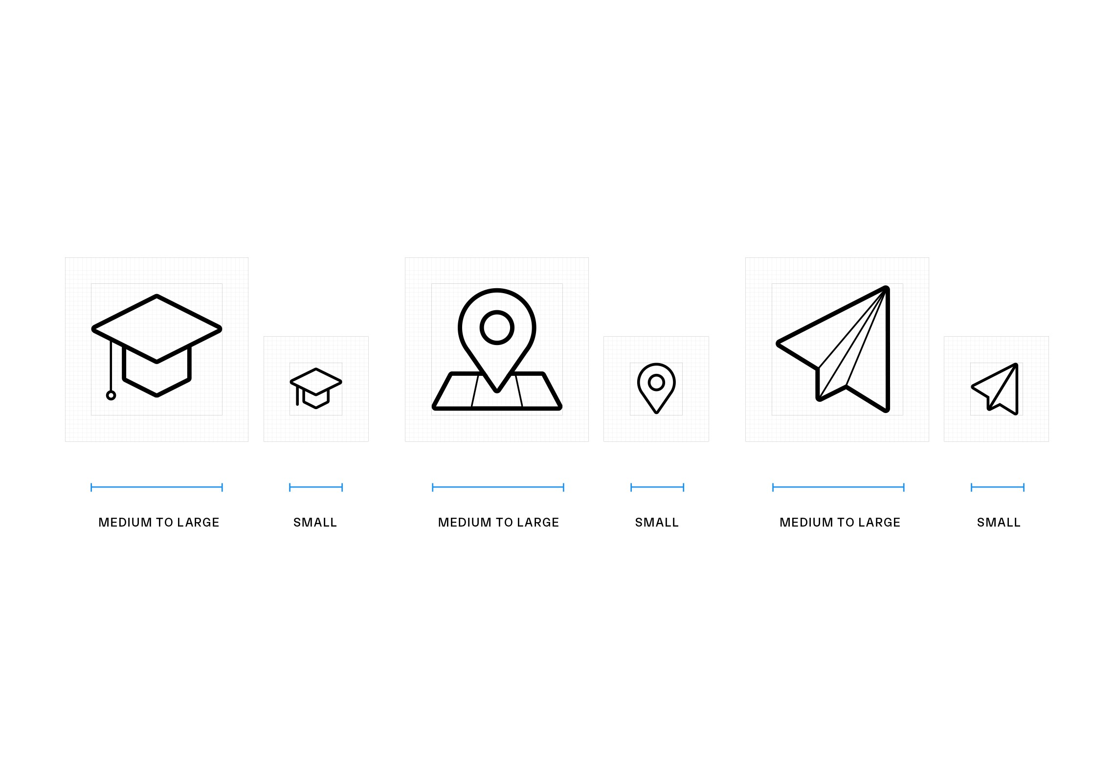
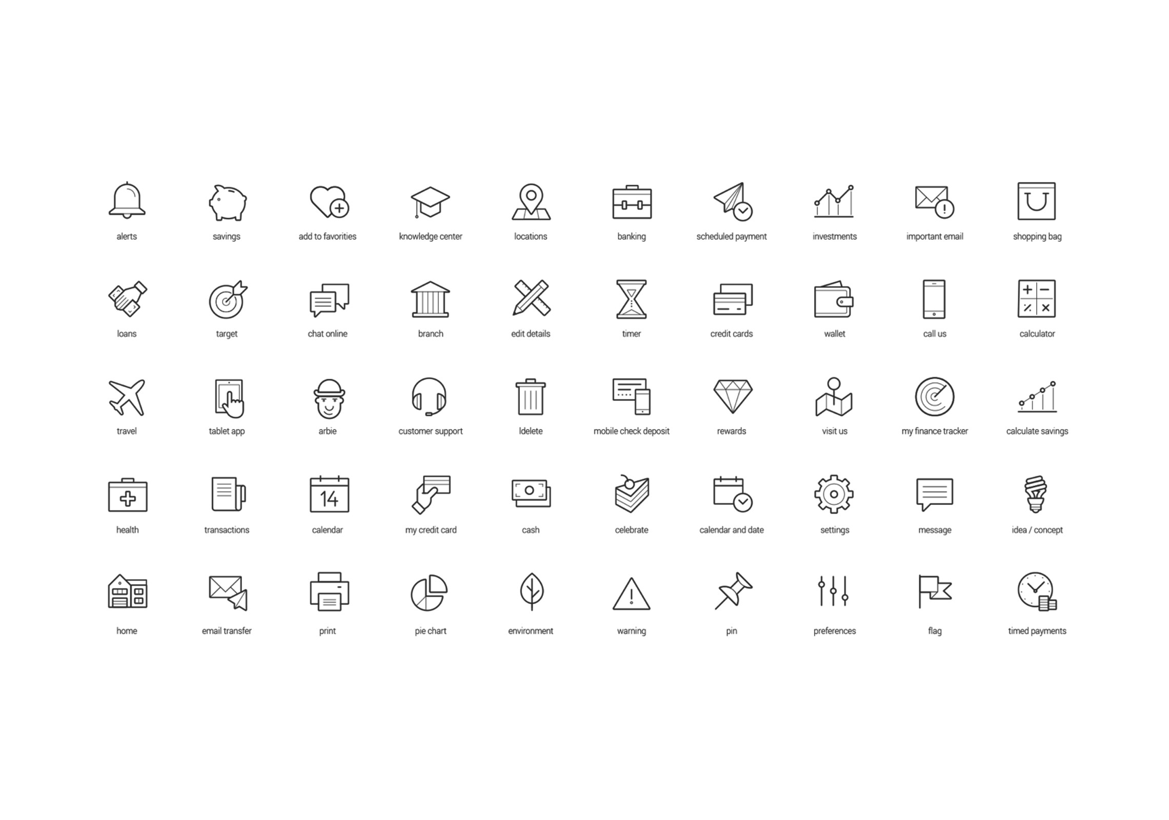
The challenge was to develop a substantial number of icons, totaling 250, to visually express various RBC products, services, and tools. Each icon needed to be visually distinct while ensuring unified iconography across different channels and platforms.

Solution
I developed an icon style that conforms to modern industry Iconography standards and performs effectively across all sizes and platforms, integrating outlines, monochrome, flat, front view, and minimal visual details.
Goal
The goal was to create a simple style that immediately conveys the essence of the icons without disrupting the visual harmony of the surrounding content. We selected contemporary, recognizable metaphors with universal meaning for the icons, ensuring that they maintain clarity and readability across all sizes, including extra-small sizes.
Impact
The redesign resulted in a more rational and visually richer solution that aligned seamlessly with the new visual identity of the bank. We established a better structure to enable the effective utilization of the design system across all teams within the organization. By ensuring that while each icon is visually distinct, the iconography is unified through channels and platforms, we were able to enhance the visual expression of RBC products, services, and tools.